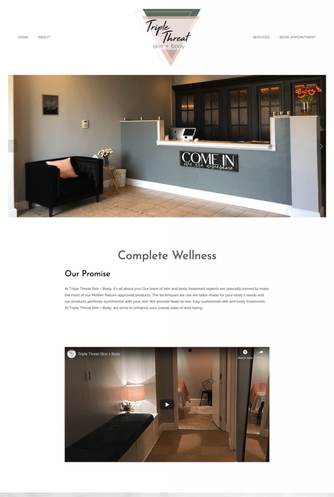
Megan came to us with some specific inspiration for how she wanted her new spa’s logo and website to feel. We developed her triangle logo to represent the “triple” in Triple Threat and the rest of the design aspects came easily after that. She really ran with it in her physical location, too, highlighting the deep green and pink as well as the gold accents throughout the different areas of her spa. The freshness of the green is a unique pop of color and her marble accents bring sophistication and luxury.
